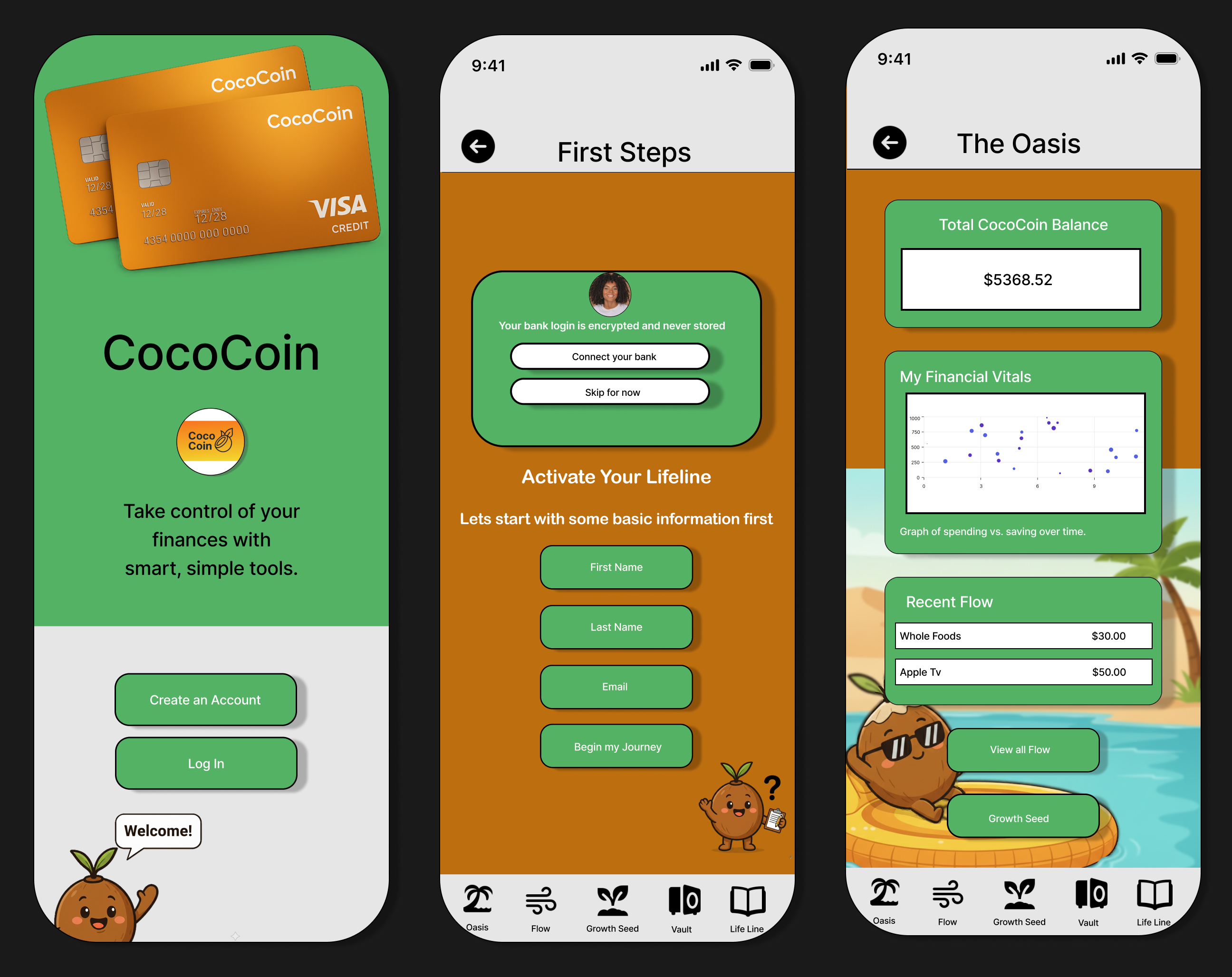
The Challenge
Modern banking apps often feel overwhelming, clinical, and difficult to navigate. Users don't abandon financial apps because they lack features — they leave because the features feel hostile. The TripleTen capstone objective was to design a digital wallet and financial tracking application that prioritizes clarity over complexity.
The core question: How do you make personal finance feel approachable without sacrificing the trust signals users expect from a financial product? The answer required understanding not just what users do in banking apps, but how they feel while doing it — and designing around that emotional reality.
Research & Discovery
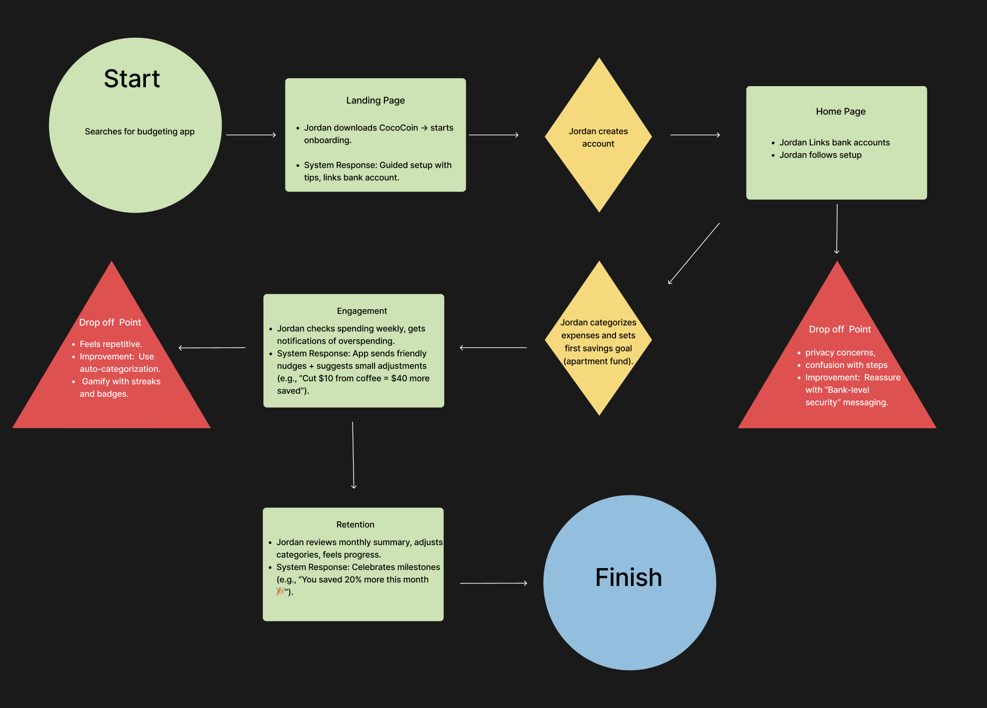
Due to the two-week project timeline, research was grounded in competitive analysis across five banking and budgeting apps, along with structured user assumption mapping. The goal was to identify recurring friction patterns — where existing products lost users to confusion, friction, or anxiety — before designing a solution.
Problem framing and journey mapping were completed before moving into high-fidelity design. This ensured the solution addressed real usability gaps rather than aesthetic preferences. The research phase surfaced three core needs: frictionless navigation, goal-oriented saving, and transparent spending insights presented without judgment.
Design System
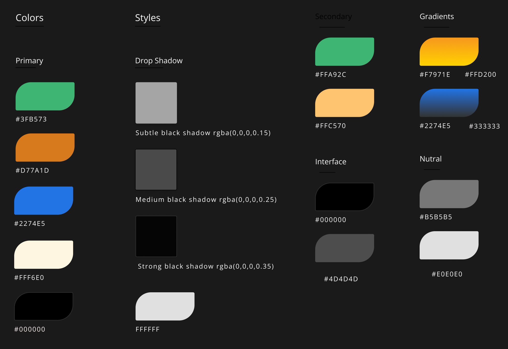
The visual language needed to balance two competing signals: the institutional trust of a financial product and the warmth of a wellness application. The color system anchors in deep greens and golds — signaling growth and value — with clean white surfaces that let data breathe without overwhelming the user.
A scalable component system was built to maintain consistency across 40+ screens. Shared spacing, typography, and layout rules reduce design drift and support efficient iteration or developer handoff. Every button, card, and input follows the same structural logic so new features slot in without redesigning existing patterns.
Cross-Platform Execution
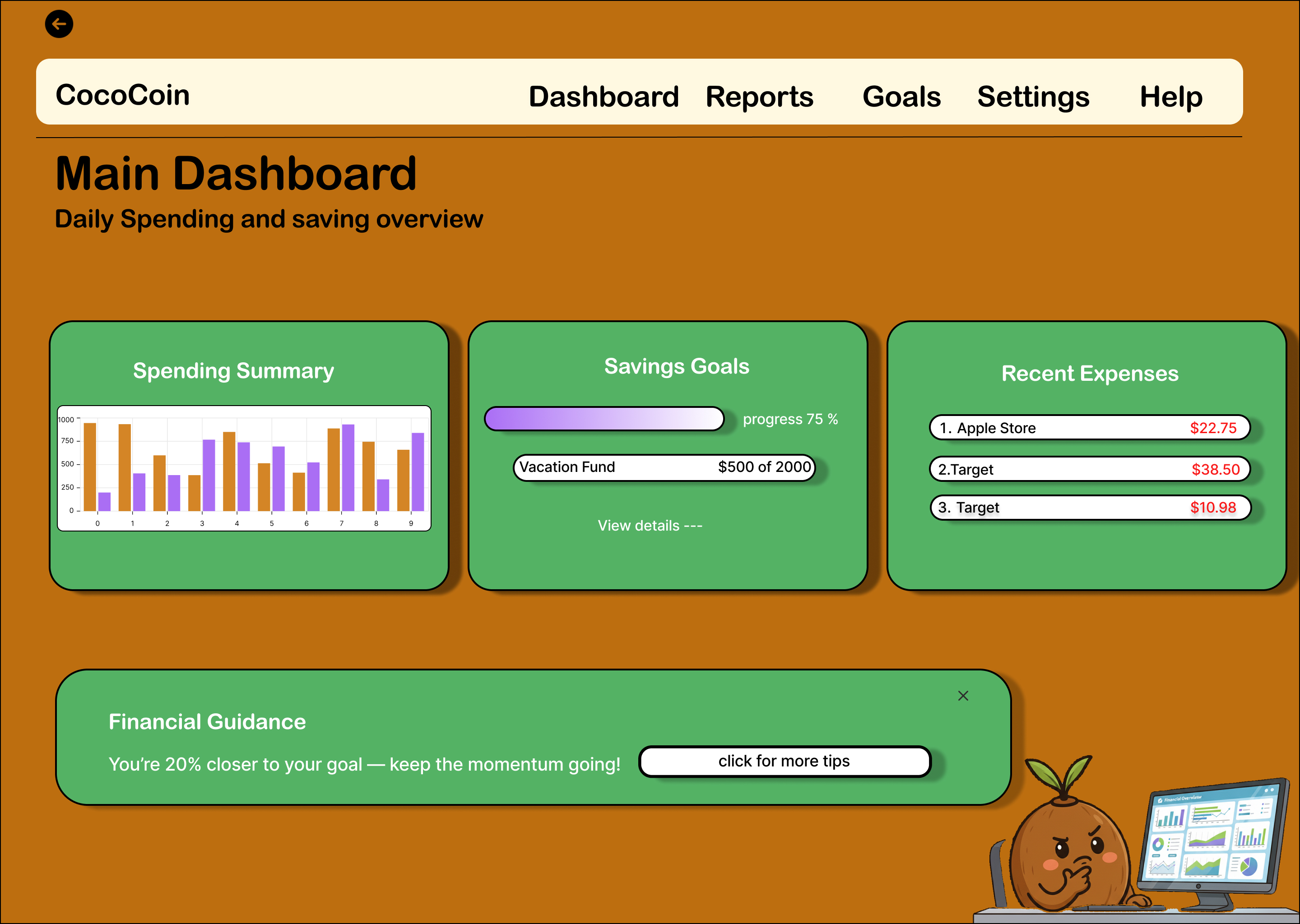
The high-fidelity prototype spans 40+ screens across mobile and desktop. The mobile experience was designed first — onboarding, account linking, spending dashboards, and goal tracking — then translated to a widescreen desktop environment that uses the additional space for data visualization rather than simply stretching the mobile layout.
Key interactions were prototyped in Figma with realistic transitions. The onboarding flow guides users from account creation through bank linking to their personalized dashboard in a minimal number of steps, prioritizing progressive disclosure over front-loading complexity.
Results & Takeaways
This project reinforced how emotional framing impacts financial UX. The goal was not just to display transactions, but to reduce friction and anxiety around money management. Design decisions focused on clarity, progressive disclosure, and supportive language to create a calmer, more intentional experience.
Research Before Pixels
Due to the two-week timeline, research was grounded in competitive analysis across five banking apps and structured assumption mapping. Problem framing and journey mapping were completed before moving into high-fidelity design to ensure the solution addressed real usability gaps rather than aesthetic preferences.
Systems Over Screens
A scalable component system was built to maintain consistency across 40+ screens. Shared spacing, typography, and layout rules reduce design drift and support efficient iteration or developer handoff.
Validate Before Delivering
Validated design decisions through structured usability walkthroughs, identifying navigation friction points and iterating before final delivery. Testing revealed that clarity and progressive disclosure mattered more than feature density.